Web design examples
Background
At BDO we use Kentico to build web pages. Over the past few years I’ve had the opportunity to develop a variety of pages, including long-form and interactive pages.
Below are some favourites.
Client: BDO Canada LLP
Year: Ongoing
Services: Web design, UX/UI, long-form content, maglr interactive
My role: Lead designer
Responsible AI Guide: A comprehensive road map to an AI governance framework
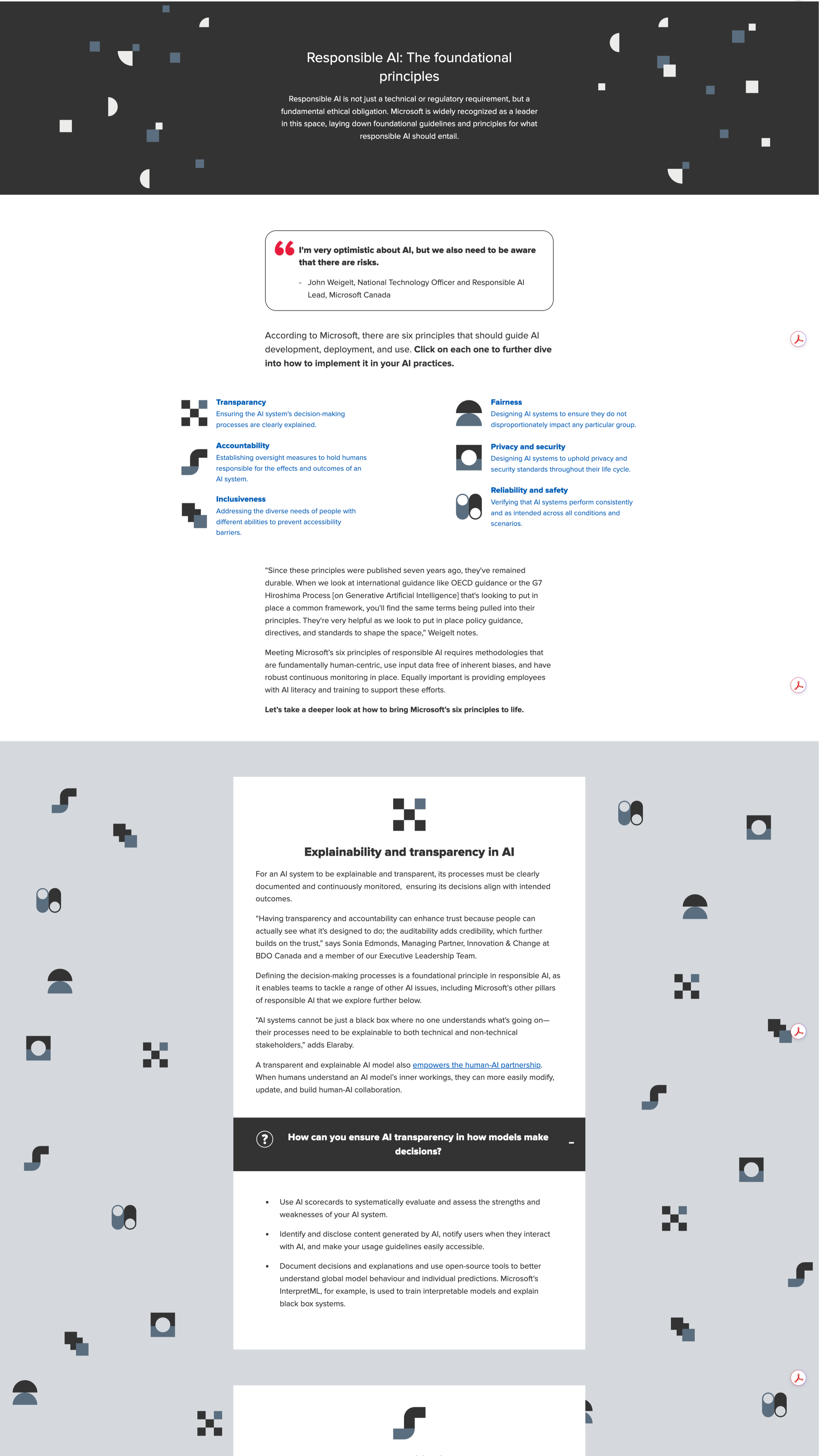
Super long form web report that focuses on AI implementation in a responsible way. (BDO, 2024).
Collaborated with content writer and marketing team to ensure information was represented in the best way for audience interpretation. All design concepts were developed by me using the BDO brand.
This piece performed quite well with many viewers reading well into the report. I think the way the content was displayed helped showcase the interesting, topical subject matter.
Resume of a fraudster
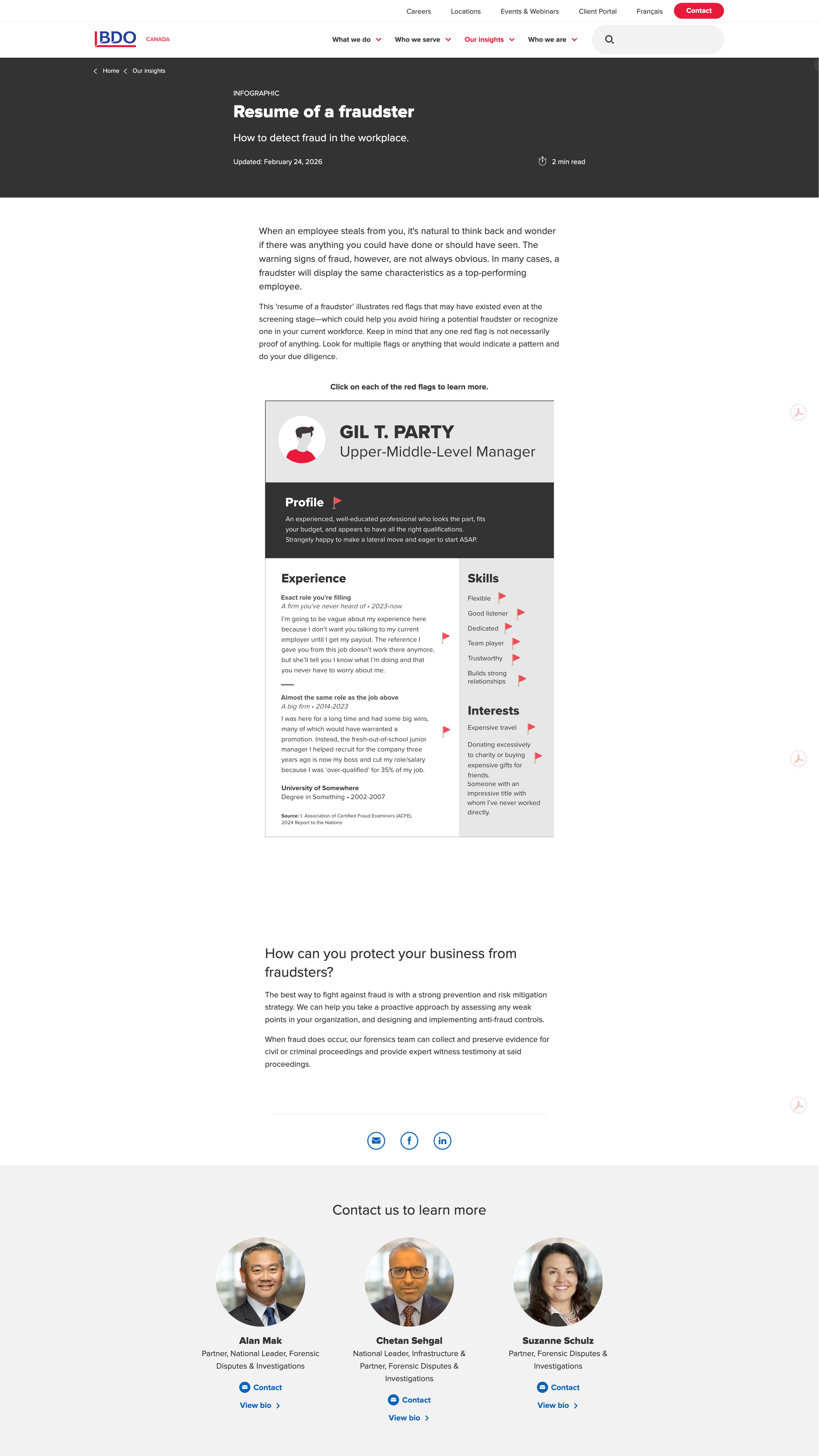
Interactive Infographic about employee fraud. (BDO, 2019)
This is one of my favourite pieces I've designed. The concept was to show a resume of someone who was a fraudster. In my concept development, I decided to use the actual red flag emojis because its something that many people are quite familiar with. I thought it was a great way to call out the content and because the actual flag content is hidden, allows you to guess why a seemingly simple characteristic could be a red flag.
This piece continues to perform well and is revamped every year as a part of our Fraud Awareness Month campaign.
Productivity paradox
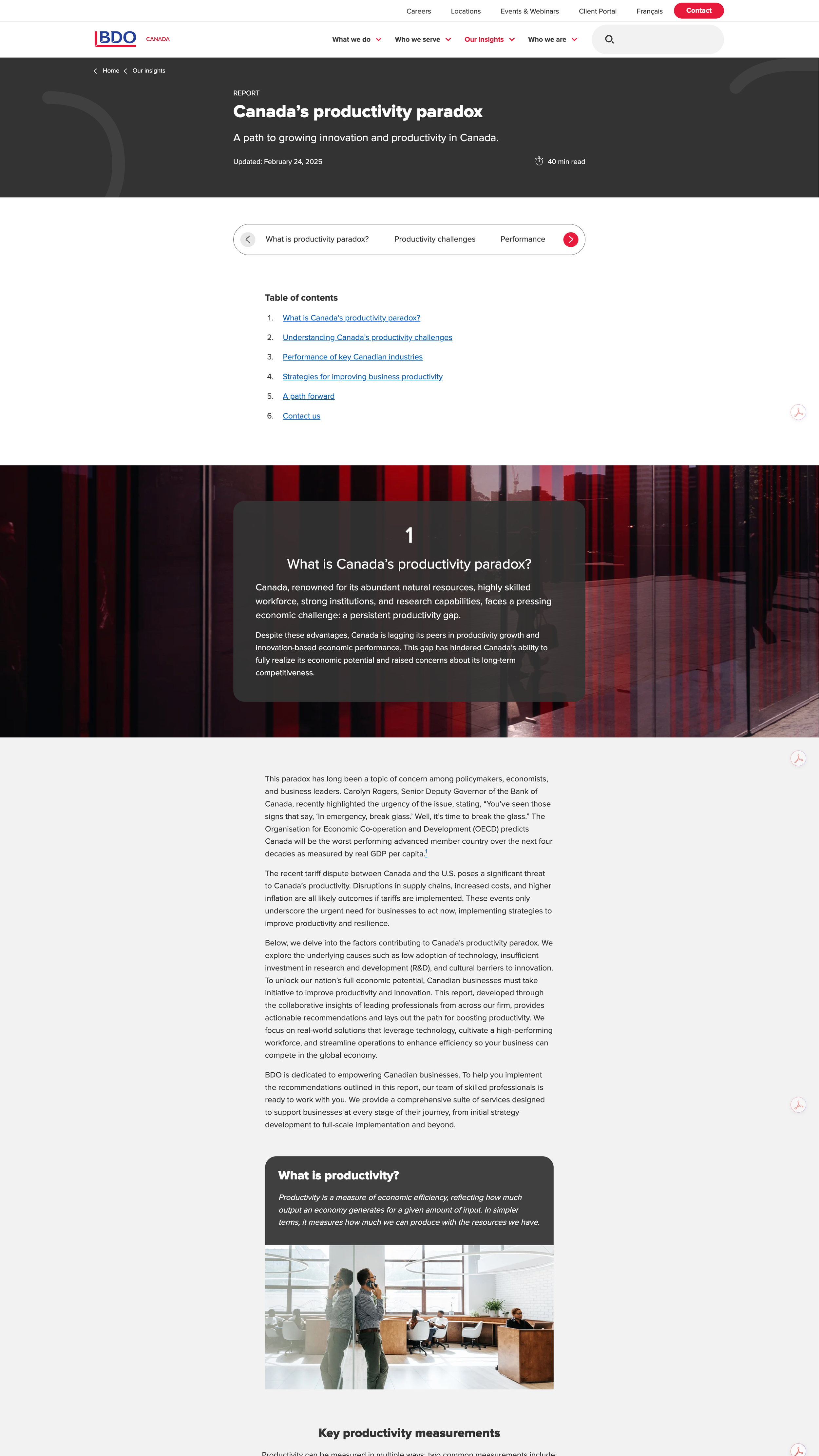
Canada's productivity paradox was the feature of one of the main campaigns at BDO in 2025. The campaign was built around a super long form web report that outlined the productivity crisis in Canada.
Challenge: This report was a challenge to produce due to length and sheer amount of content. I aimed to develop repetition throughout the report to help guide the reader; Strong chapter sections, good navigation and a flow that helped guide the reader to the most significant content.
Wins: Despite its length, this piece had quite strong analytics with many visitors spending a lot of time on the page and high scroll depth. I used Maglr to create accessible infographics to really visualize the content, where possible. I think this also helped to hold interest and hook the reader with interesting stats.
Navigating business growth
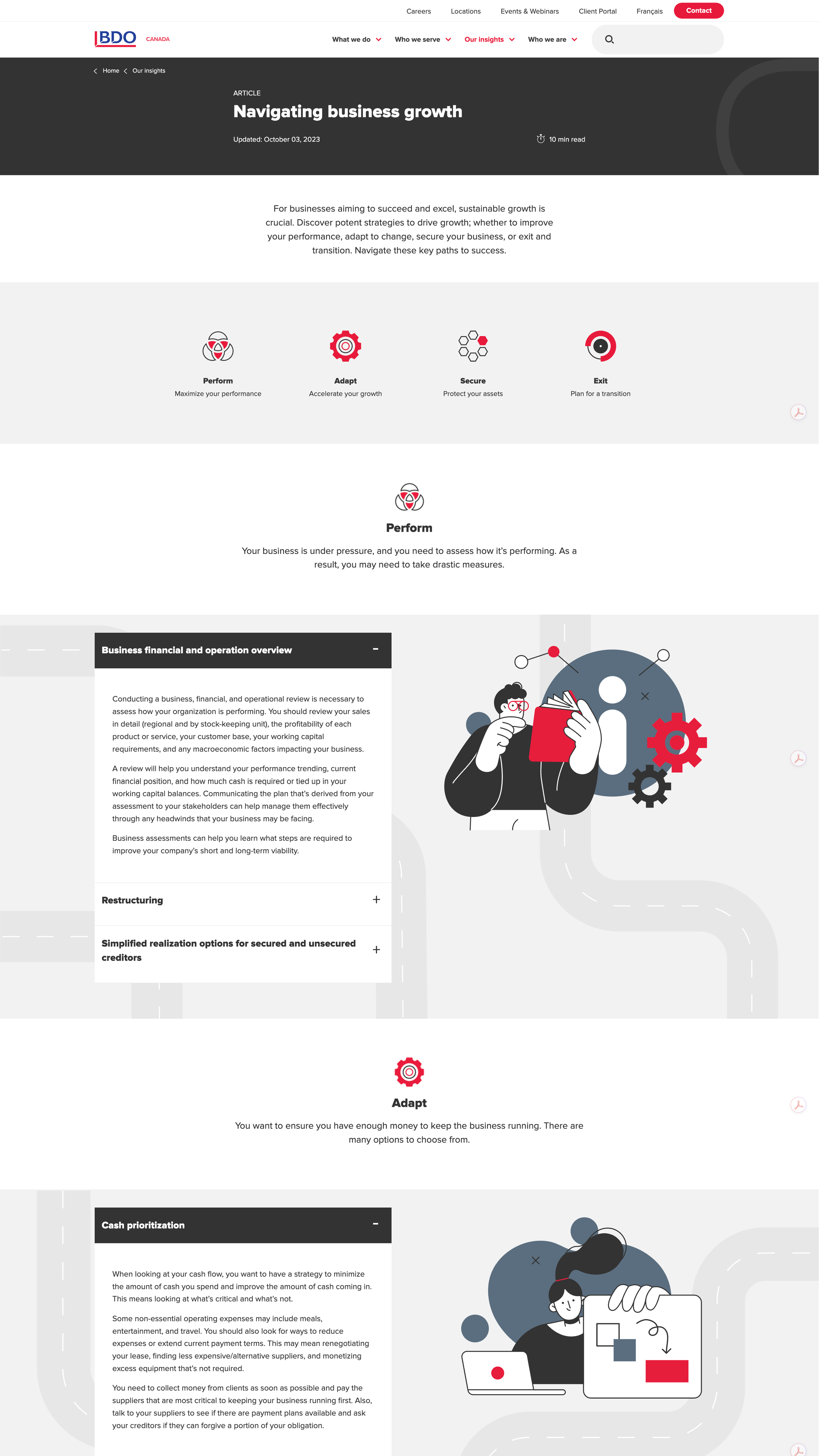
Roadmap infographic article to help entrepreneurs with business decisions. (BDO, 2024)
This piece was a revamp of a similar piece geared towards entrepreneurs and how BDO can help, depending on their needs. The original idea was to keep this as a roadmap, but with accessibility and user experience, I ended up creating something a little simpler in terms of navigation. Viewers can still jump around the piece to focus on the areas that are relevant to them, but its much more user friendly, mobile friendly, and clear and concise.