Sick day co.
Background
Sick Day Co. was a project I started several years ago. After going through some tough times, I realized the importance of self-care and keeping the fun in life. I developed this small project, making handmade products geared towards self-care but focusing on a more playful side that I felt people could resonate with.
Client: Personal Project
Year: Ongoing
Services: Branding, D2C, Social media, E-commerce
My role: Owner, maker, designer :)
Brand
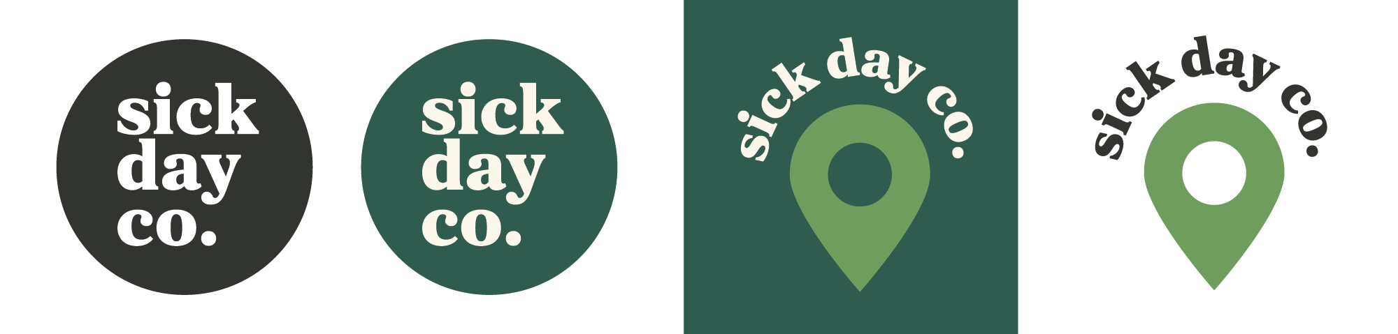
I went through a couple iterations of the brand, but I wanted the logo to be bold, yet simple and something that would be easy to stamp on products, make into stickers, and use on signage, packaging and other general materials. Eventually I created a variation of the logo with a map pin because i was often attending events and using promo materials from the event organizers. This new variation allowed me to add my logo and quickly highlighting that I would be there without having to reconfigure the existing design.
Colour
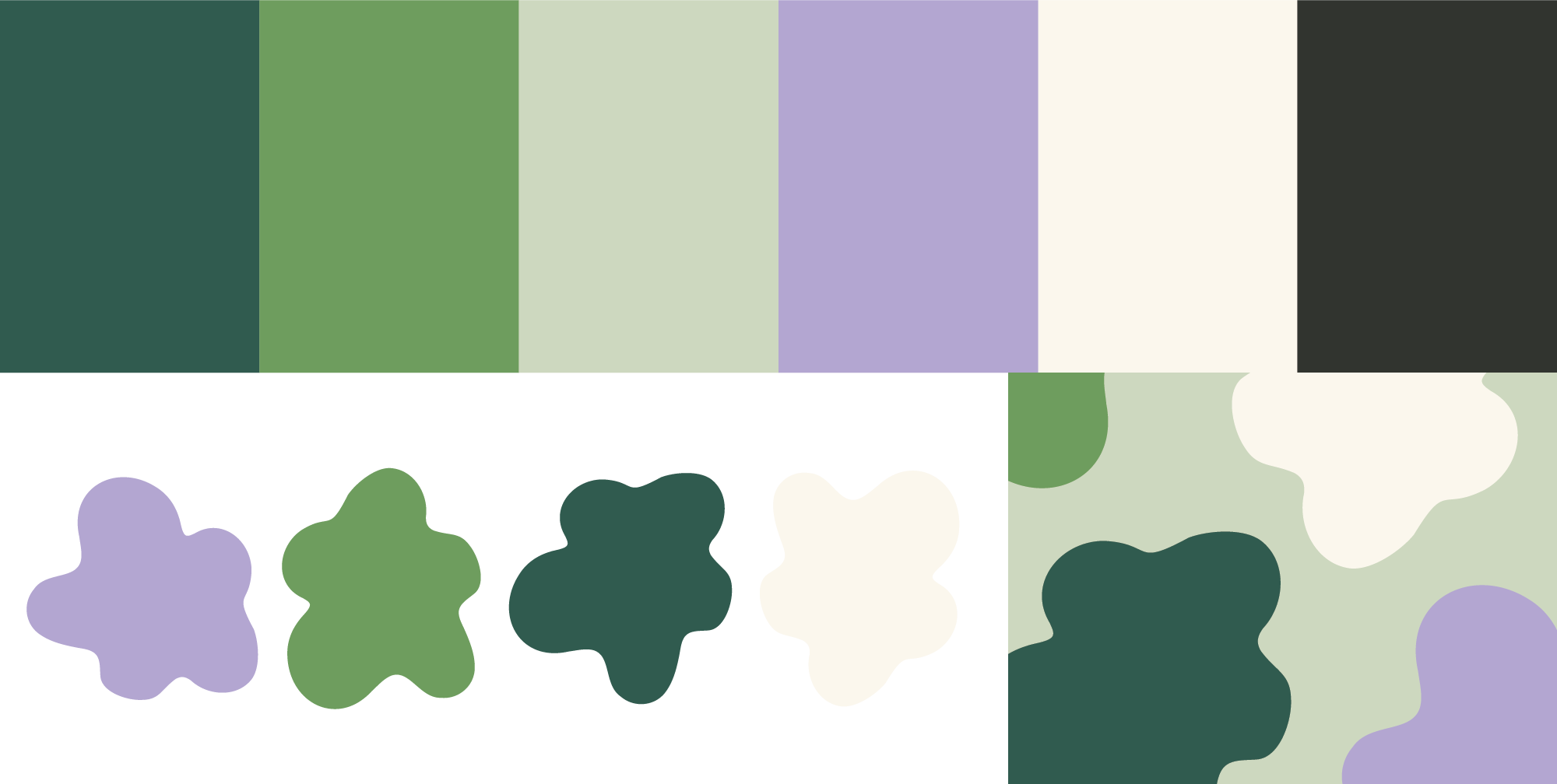
The colour palette is a nice mix of calming pastels and brighter shades that come together to make a nice, accessible-friendly set. I was initially inspired by a ski jacket I had gotten that was green and purple so I played with some combos until I found a set that worked. I also like that the greens feel really natural without being a literal leaf or plant. This is also true for the little leaf/flower blobs I created as a texture for the brand. They give a nice organic feel while remaining abstract.
Application
There is quite a variety of applications but I overall kept everything simple. My products themselves are colourful and bright and often patterned, so I didn't want to take away from that. Even my social media is very clean and calming to give people that feeling of peace before they even interact with the products.
Social
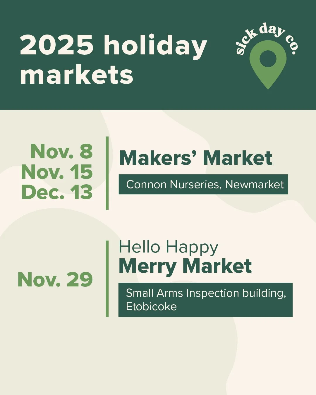
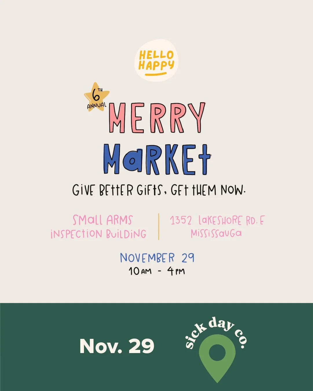
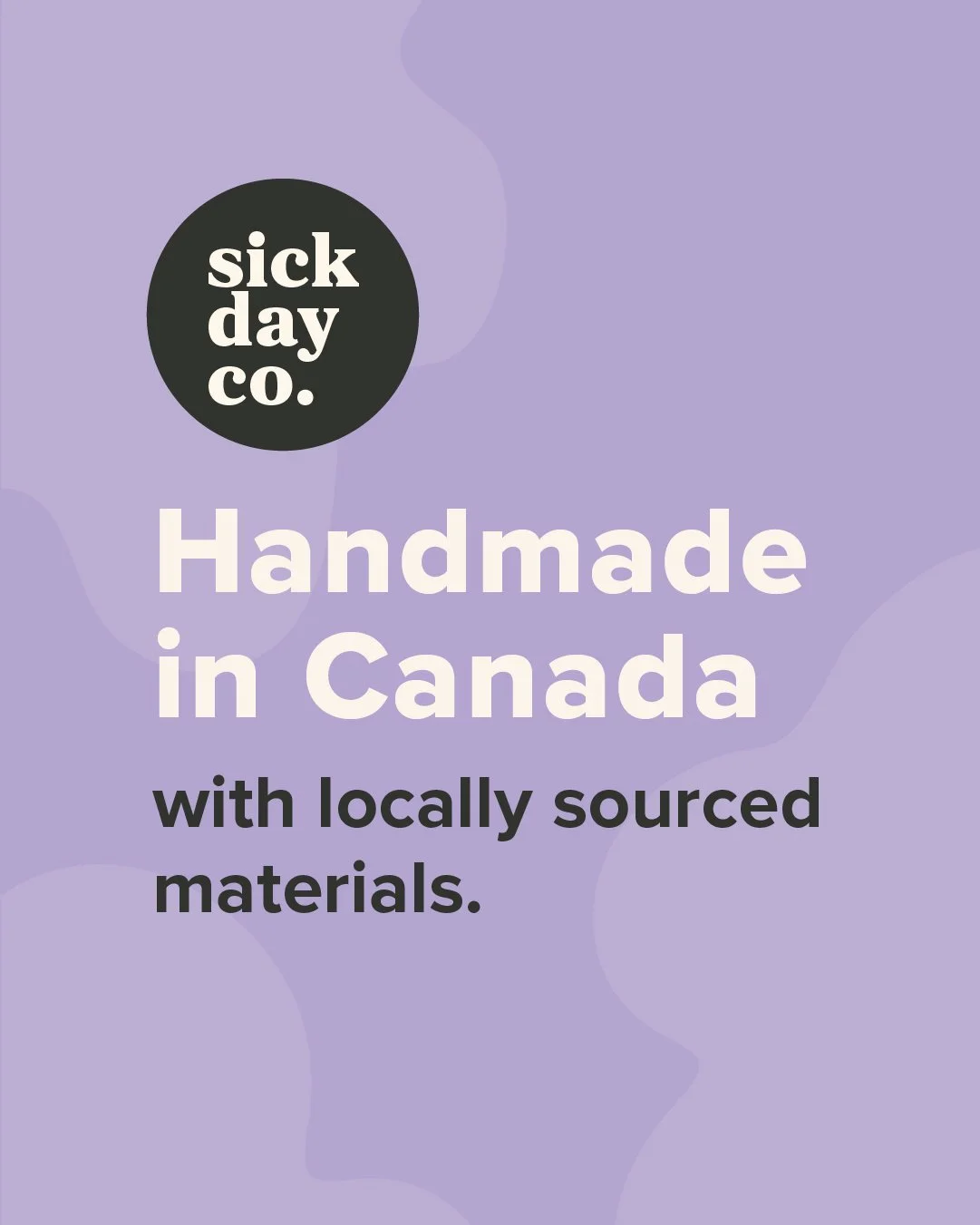
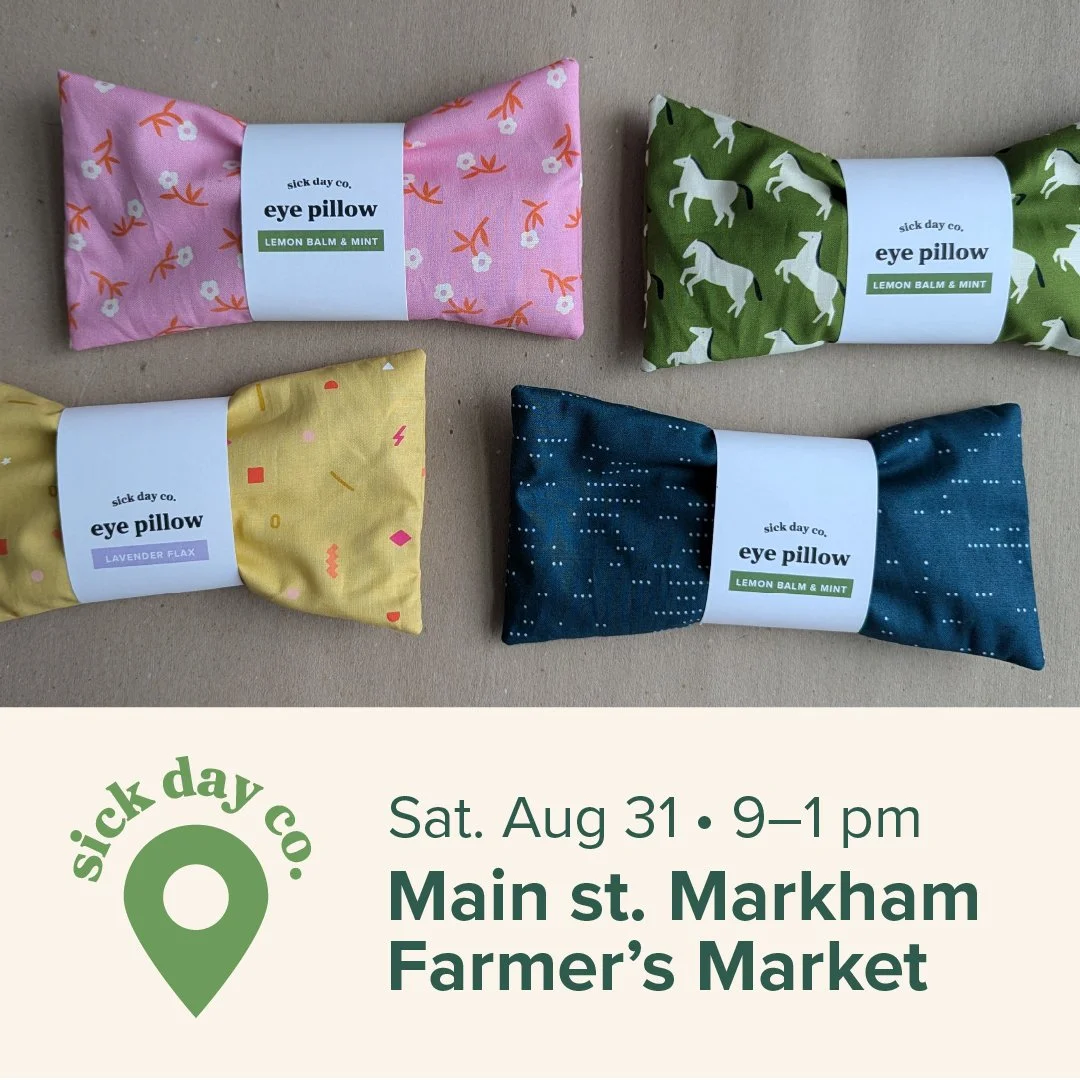
Below is a variety of social media examples. The map pin logo is used on any event materials and while each piece is unique, they all fit within the same brand. I also showcase my products where possible, in a clean and organized way.
Website
Right now, the website is mainly just a hub with information on how to get my products. I feature retail spots to shop in person, and upcoming markets so I can be personally found. I also link out to my Etsy shop where people can purchase products online. Eventually, I hope to move the e-commerce portion to my own site.
Applications
-
![A flyer listing dates and locations for holiday markets in 2025, including Makers' Market at Connon Nurseries in Newmarket from November 8 to December 13, and Merry Market at Small Arms Inspection Building in Etobicoke on November 29.]()
Social media
-
![Event flyer for the 6th Annual Merry Market, featuring colorful text with event details including date, time, location, and slogan 'Give Better Gifts. Get Them Now.' The flyer has a light background with a dark green footer.]()
Social media - joint post
-
![Purple background with black circle containing white text 'sick day co.' and large white text 'Handmade in Canada with locally sourced materials'.]()
Social media
-
![Four fabric eye pillows with colorful patterns and labels, arranged on a beige background, advertising a market event held on Saturday, August 31 from 9 am to 1 pm at Main St. Markham Farmer's Market.]()
Social media - event promo
-
![Colorful abstract background with the text 'sick day co.' in white letters inside a black circle.]()
Social profile image
-
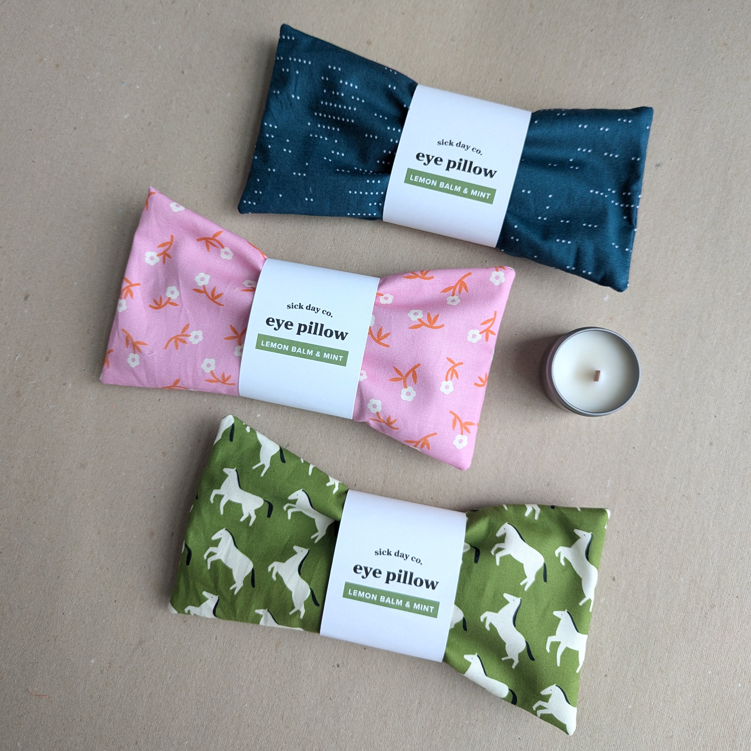
![Three folded eye pillows with colorful textiles and white labels on a beige surface, labeled 'sick day co.' and 'eye pillow' with scents 'Lemon Balm & Mint'.]()
Eye pillow packaging
-
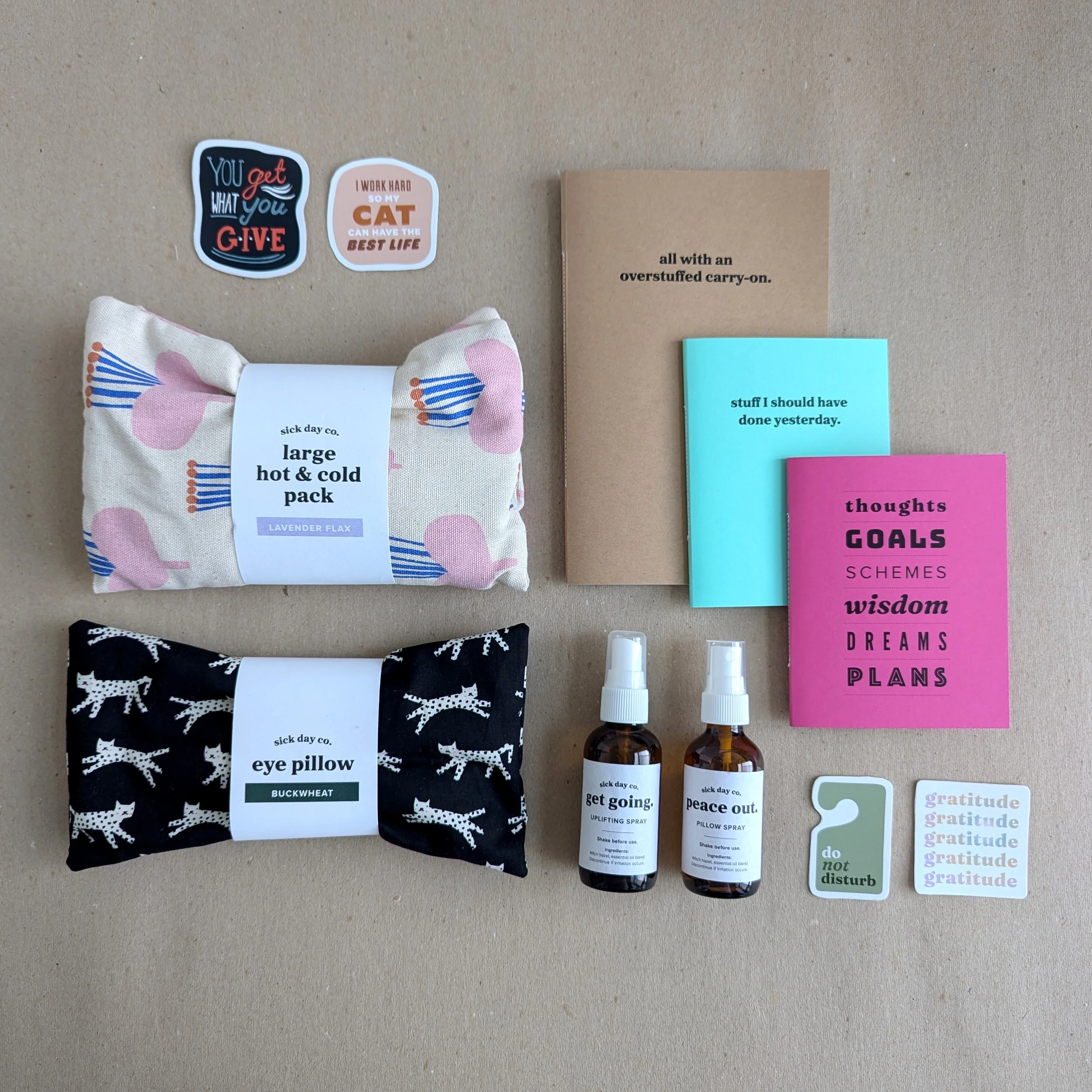
![A beige background with various items attached, including motivational stickers, a fabric pouch with a floral design labeled 'large hot & cold pack,' two small spray bottles, and various colored sticky notes with quotes on them.]()
Product shot
-
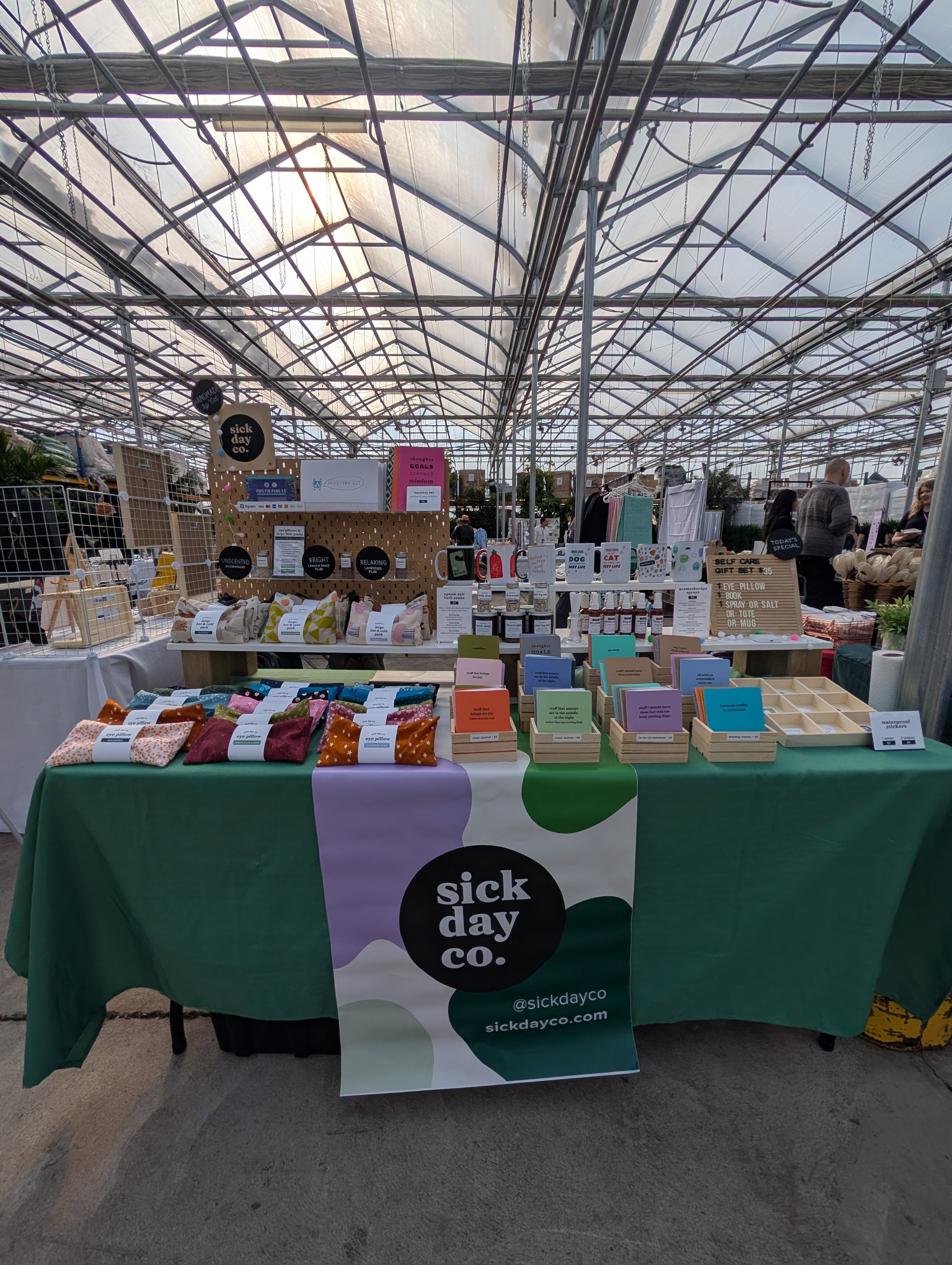
![A booth display at a market with a green, white, and purple tablecloth bearing the logo 'sick day co.' and various wellness products. The background shows a greenhouse-style roof with metal framework.]()
Event branding
-
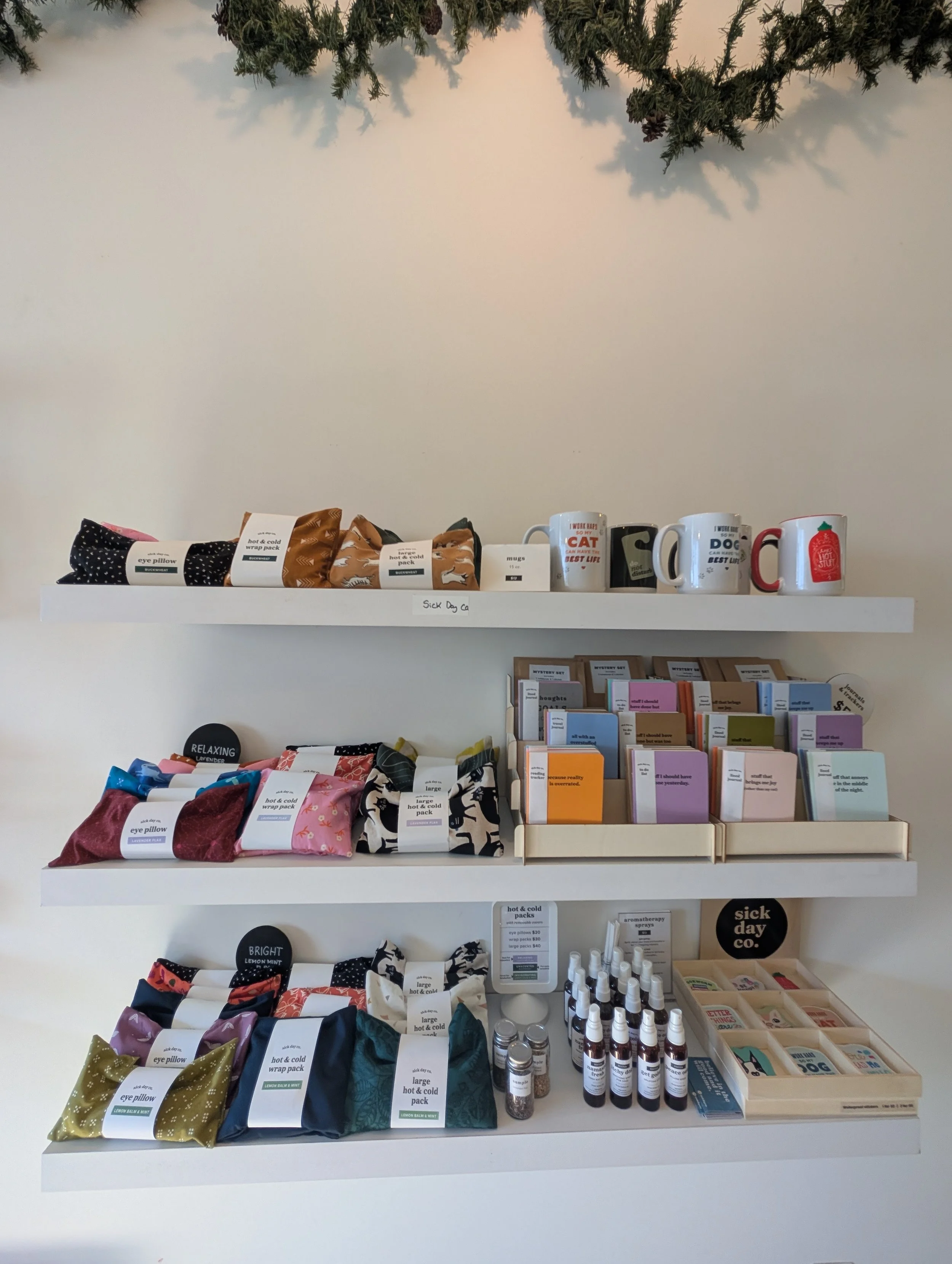
![Display of various products on shelves, including eye pillows with polka dot and floral patterns, hot and cold wrap packs with lemon and mint designs, character-themed mugs, and small bottles, with some books or pamphlets in a wooden tray below. A small sign reads 'sick day co.'.]()
Pop-up setup