Match made mutts
Background
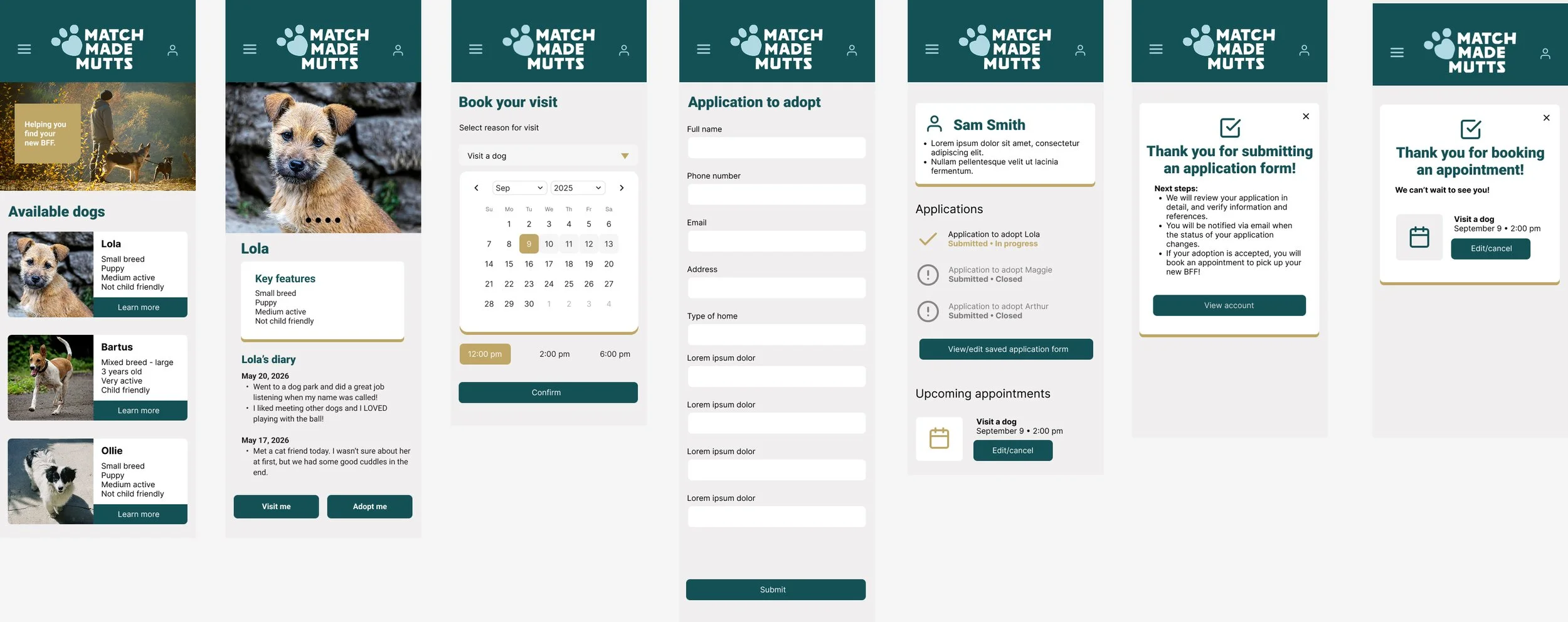
In the past year I’ve started to dive deeper into UX/UI and using Figma. I’ve been working through the Google UX course and developing this app and site as part of my learning. While its still a work in progress, I’m happy with my progress as its the first true UX project I’ve developed from start to finish.
I’ve been really enjoying this process and learning to design in a different way, and look forward to working in this area more in the future.
Client: Personal project (through Google UX course)
Year: 2026
My role: Lead designer
Current final product
Research and development
Design an app and a responsive website for a metropolitan animal shelter network to increase successful long-term pet adoptions and simplify the application process.
Pain points
The site is never up to date because staff notes need to be added manually
Work is duplicated because the site needs to be updated separately from the staff’s notes
Admin gets bogged down with update requests because the website is never up to date and people don’t fill in applications fully
Personas
Amy is a 40 year old animal shelter manager. She manages the animal shelter staff, does intake on new animals and helps to vet adoptees who send in applications. She often gets stuck late at the shelter following up on questions, following up on application details and reviewing staff notes about the pets. She wishes the process would be more streamlined so she can focus on important things, like ensuring pets end up in the right home.
Janice is a 28 year old shelter staff who takes care of pets after intake who are awaiting their foster home. She takes great photos of the pets for their adoption page and makes good notes about their temperament but she notices it takes a long time for Amy to upload these details to the website, which disappoints her. She often meets applicants who are disappointed that pets they’ve seen online are already adopted and answers a lot of questions about which pets are available and what their care is like.
Joe and Sam are a 31 year old couple who were looking to adopt a pet from an animal shelter. They were watching the shelter’s site online waiting for a dog that matched their lifestyle. The process was long and confusing because they weren’t sure what information was needed on the long application, and it took the shelter a long time to reply to their questions. When they finally went to the shelter to visit the dogs, they didn’t see the one they were looking for.
Problem statements
Amy is an animal shelter manager who needs an easy intake and pet management system so that more pets can be adopted out.
Janice needs a better admin system at the shelter so that she has all the information she needs to get more pets adopted out.
Joe and Sam are a couple who need a clear, comprehensive process and education system so that they can adopt the best dog for them.
Goal statement
Our shelter app will let users view up to date information about available pets which will affect potential adopters by giving them the information they need upfront to ensure a successful placement. We will measure effectiveness by tracking the number of successful adoptions.
Value proposition
Our shelter app will let users view up to date information about available pets, quizzes to help potential adopters to choose a pet that matches their lifestyle and lots of information for new pet owners. The app also allows adopters to submit applications online with the ability go back to add more information and check progress on application. Appointments can be made to visit the shelter to see pets or meet with manager and staff to get undivided attention to ask questions and make assessments. All of these values also help shelter staff by easing admin work, creating dedicated time to meet with adopters and essentially adopt out more pets to better matched homes.
Wireframe
After sketching a bunch of variations on different home screens, I moved my favourite layouts into Figma.
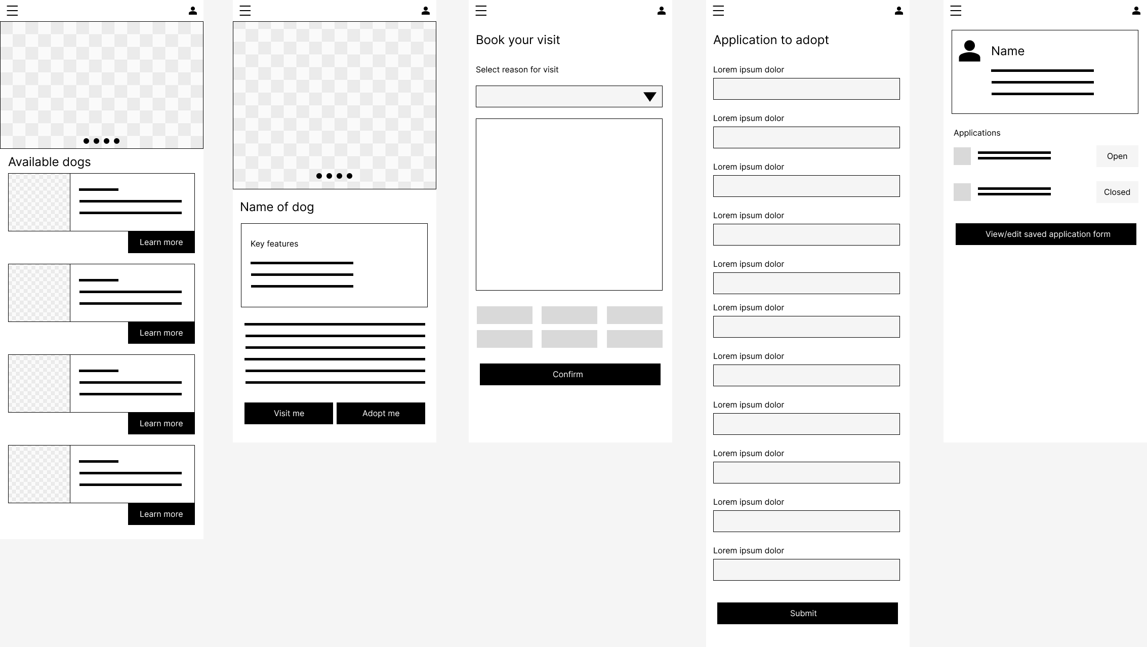
Digital wireframe
From here, I refined the wireframe and created a working prototype. This allowed me to fill in extra screens that may have been missing and add in some UI elements to help with clarity. I did some testing with friends here to help refine the flow.
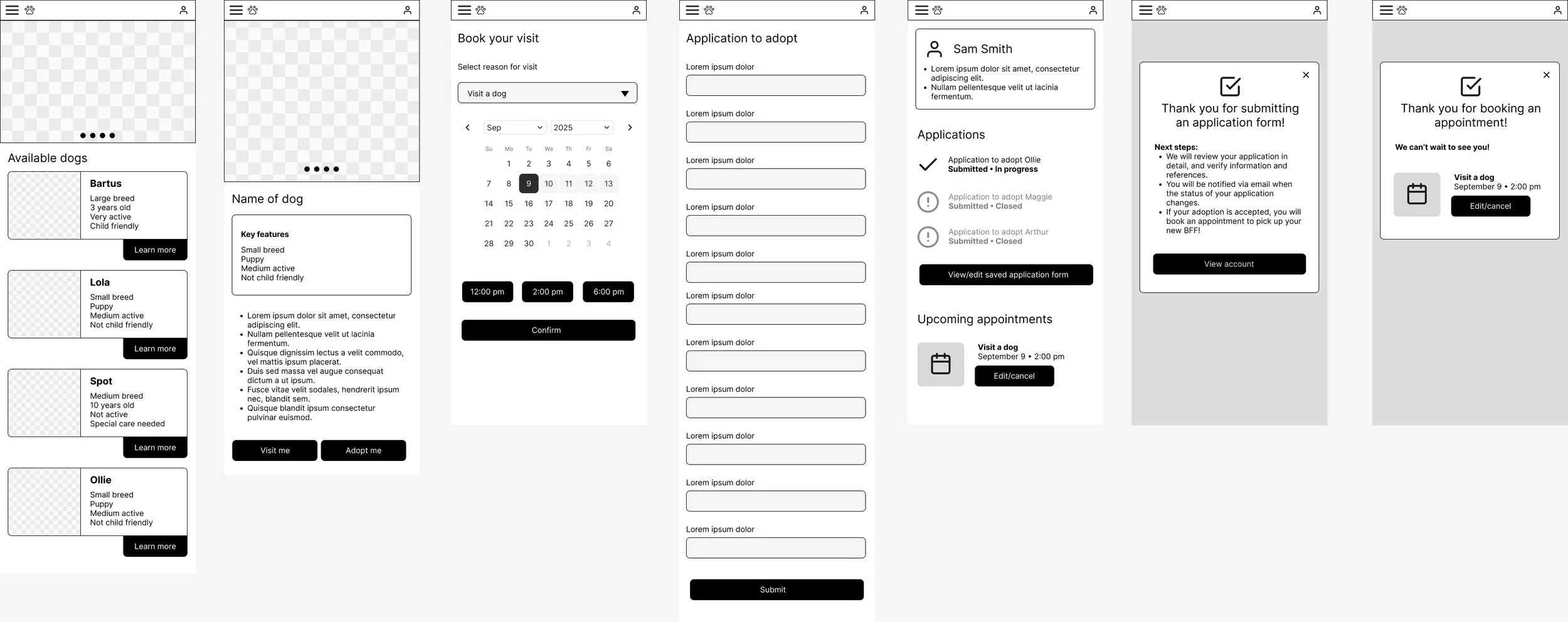
High fidelity wireframe
Once I was happy with the overall flow and experience, I (finally!) began to add design to app, developing a brand to go along with the app and refining further. I went through a few iterations of colours and styles considering the audience and accessibility.