Do more together brand campaign
Background
In 2025, BDO initiated a large-scale brand campaign with the purpose of gaining brand recognition across markets.
Client: BDO Canada LLP
Year: 2026
Services: Branding and governance, Template creation, Visual system creation, Internal marketing and launch
My role: Brand operations lead / Design manager
The overall "Do more together" brand campaign was developed by an agency partner with feedback and guidance from the BDO team. I was responsible for expanding on this creative to develop an overall BDO Canada brand update that would support this campaign.
Pain points
BDO Canada operates within a global network, which means any deviation from the parent brand required executive sign-off.
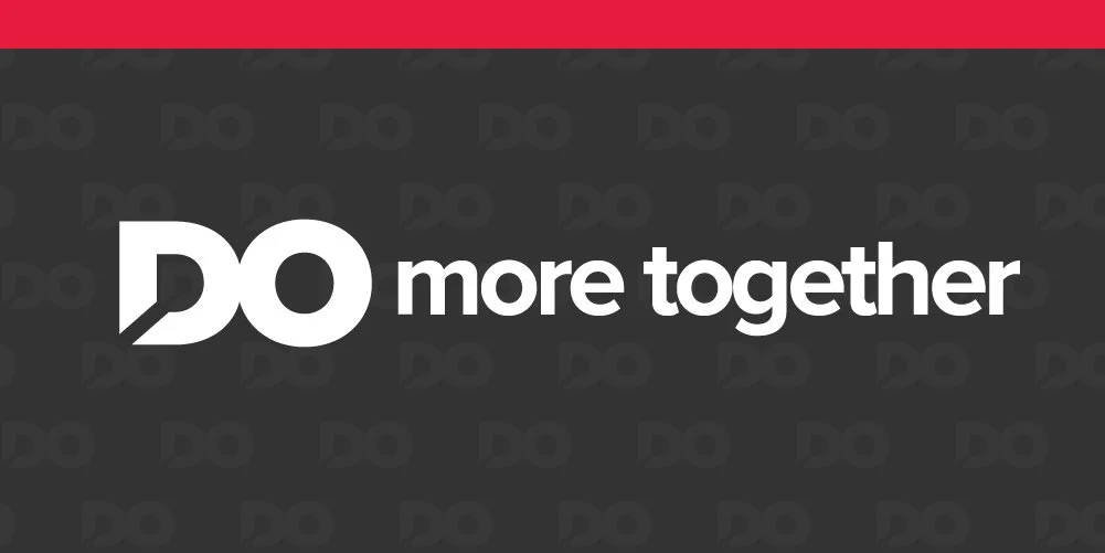
The agency originally came up with a wordmark for the new tagline, but upon launching, there was immediate confusion that this was our new logo.
People across the firm didn’t always use the brand in a “correct” and efficient way. The global brand guidelines were clunky and long and difficult for a general audience to understand, and our brand resource centre was difficult to use and update.
Considerations
Global cohesion: Even with creative latitude, we needed to remain recognizable within the BDO network and consistent enough to work alongside member firms in other countries.
Bilingual execution: As a coast-to-coast Canadian company, all solutions had to work equally well in English and French.
Accessibility: AAA AODA compliance was a baseline requirement, so accessibility was built into the guidelines rather than treated as an afterthought.
Designer flexibility: The previous templates were rigid. My goal was to create a system that provided structure and ready-to-use assets, while giving designers enough creative freedom to develop strong, efficient work.
Website redesign
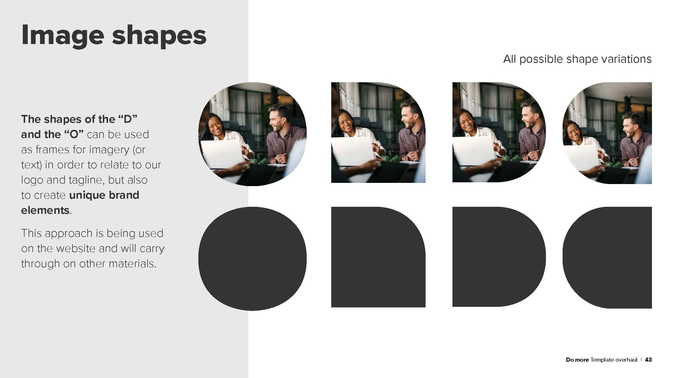
I worked with the web strategy manager to brainstorm ideas for the website update, after many iterations (mainly on her end) we came up with an idea to use the shapes found in the “D” and “O” as our brand differentiator.
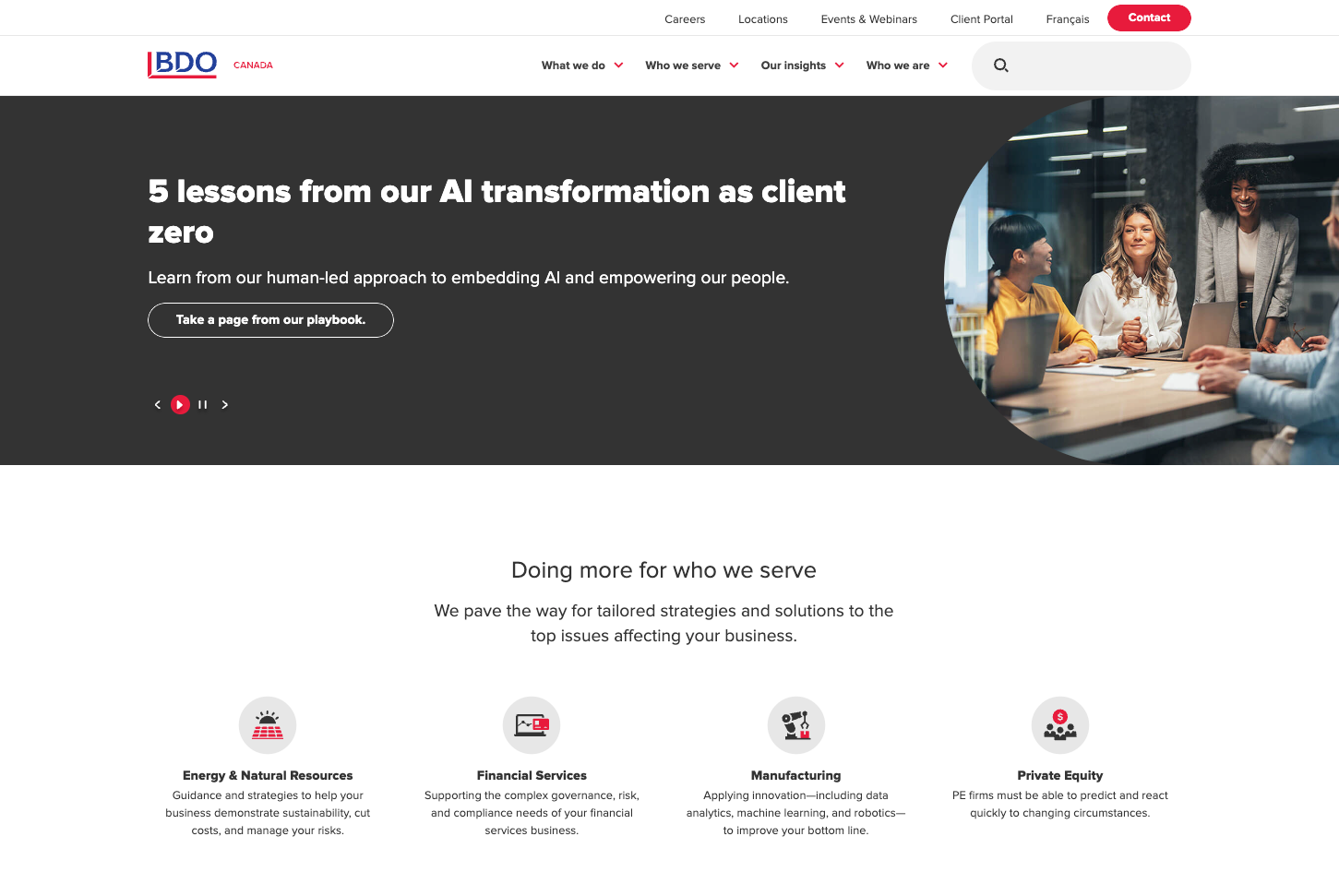
I pulled those shapes out, tested them across applications, and they proved to be exactly what we were looking for. Once we brought it to life on the site and got approval at every level, we had our foundation to roll out across the rest of our materials. View full website
Company-wide assets
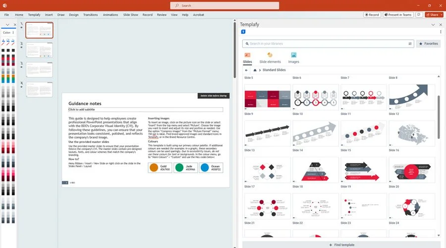
I developed a general PPT template with a wide range of master slides, and then provide an additional deck that has a variety of slides built out with infographics, icons, etc. This is supplemented with on-brand image and icon banks making it easy for our people to use the brand.
Social media launch
I developed this teaser video for the launch of the tagline to show how the “do” is in our name.
Developing an updated brand
Once the website was updated and approved, it was time to carry over these changes to templates and assets for the design team and the firm.
Design updates
I expanded the website "curves" style across our full range of outputs — social media, printed sell sheets, email and email banners, and paid media. It was a collaborative process; I worked closely with the design team to test ideas and applications gradually, gathering their feedback along the way to make sure we landed on something we all knew would work.
Once we had sign-off at every level, I developed design templates covering the core brand elements — logo size and placement, type styles, colour palette — and paired them with an asset library of brand shapes and elements to make it easy for designers to experiment and build efficiently.
Below is a selection of pages from the document I developed to outline the brand update with examples of usage as well as guidelines on asset usage.
Empowering our people
Once I established the main set of guidelines for overall brand, “quick set” for general reference. This was a simplified version of the guidelines that focused on logo usage, colours, accessibility and general best practices.
Using the new brand style, I worked with members on my team to update our office templates, video call backgrounds, social images, etc.
I then built a new "Brand Resource Centre" on Sharepoint — our internal intranet, that was much simpler than our previous solution. I reviewed feedback and pain points to come up with a solution that has gained great feedback and usage. It is now a single page site with jump-links, clear navigation and headings, and a library with an easy-to-understand folder structure.